Interactive population pyramid
Introduction
This tool allows visualizing the territorial and municipal population pyramids, since 1976 for 2026.

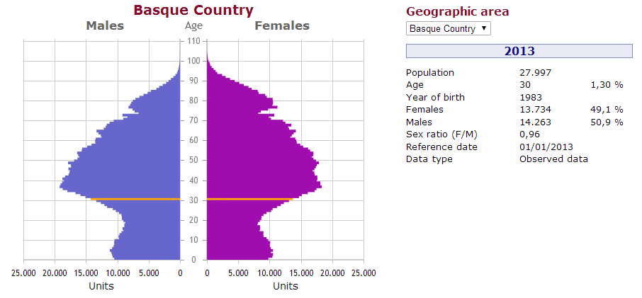
On the left side of the display there are shown:
- Population pyramid corresponding to the selected year (upper side). Two types of population pyramids are used: in geographical areas with a total population of over 1200 inhabitants pyramids which represent all ages and otherwise pyramids where the ages are grouped into 5-year intervals.
- Control panel for the animation of the pyramid, and other options.
On the right side there are, from top to bottom:
- Option to select the geographical area.
- Information area which reflects the characteristics of the pyramid. Selecting an age or positioning the cursor over an age (or age range) the information corresponding to that age is displayed.
- Distribution of the total population into three age groups, as table (total, percentages and sex ratio). It allows changing the age groups.
- Line chart of the bottom side. Besides showing the evolution of the total population, it allows quick navigation between the pyramids of different years.
Show information of an age (or age group)
The information area on the right side of the screen shows the overview of the selected pyramid. By acting on the pyramid, the information area will update and show the information corresponding to the selected age (or age group). There are two possible actions on the bars of the pyramid:
- Click. The information sets fixed until making a new selection or re-clicking on the selected age. Option available only for pyramids showing all ages (without grouping).
- Move the cursor. In shows the information corresponding to the bar (age or age group) to which is pointing the cursor at that moment.
Both actions are reflected in the pyramid, the bar corresponding to the age (or age group) selected in orange.
Animation options
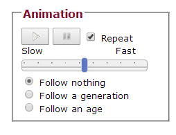
The animation section comprises a control panel, a slider to determine speed and a tracking selector.
-
Control panel
- Play. Start consecutive display of the pyramids of different years.
- Pause. Pauses the display of the animation.
- Repeat. Option to restart the animation display when reaching the last year.
- Slider which determines speed. Bar that allows setting the display speed.
-
Tracking selector.
- Follow nothing. Option that allows following the evolution of the general population during the animation.
- Follow generation. Option that allows following the evolution of the selected generation during the animation.
- Follow age. Option that allows following the evolution of the selected age during the animation.
More options of the pyramid
The following actions are reflected directly on the pyramid:
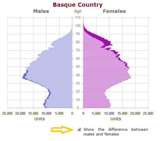
- Show the difference between males and females.
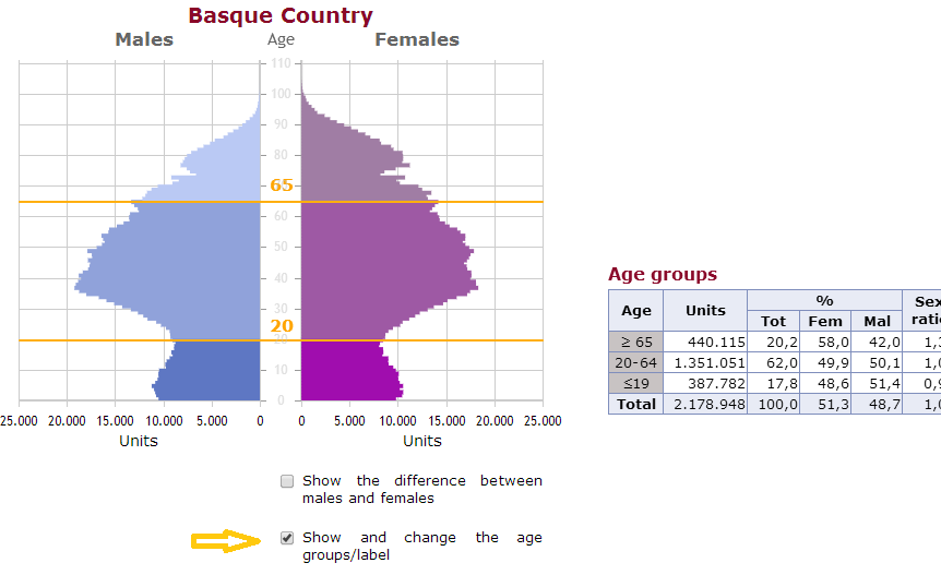
- Show and change the age groups.
Show the difference between males and females
To show age (or ages) where the male population is higher than female population OR vice versa, click the box "Show the difference between men and women" in the lower right part of the pyramid. To return to the original pyramid click on the box again.
Show and change the age groups
The table on the right center side of the screen ("Age groups") shows the distribution of the total population into three age groups. It shows, for each age group, the total population, the total percentages of women and men and the sex ratio. Clicking on the box "Show and change the age groups", a slider is displayed on the pyramid (in orange), which allows changing the age groups of the table, dragging any side of it.
Choose geographic area
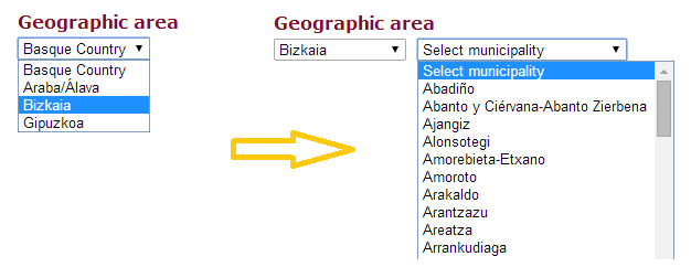
To select the desired geographical area you must click on the box on the top right of the screen ("Geographic Area"). This option displays the data for the selected geographic area (Basque Country, Araba/Ãlava, Bizkaia, Gipuzkoa). When choosing any of the three Provinces, a second box is showed on the right of the box mentioned, which shows the municipalities of the selected Province.
Evolution of the total population
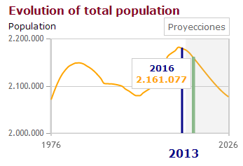
Line chart that shows the distribution of the total population of a geographic area. By bringing the mouse, a dialog box that contains information about that item appears; specifically representing the year and the total population. The vertical blue bar indicates the year of visualization. In addition to the Basque Country and the three Provinces, the shaded area on the right side of the chart represents projections, as shown in the legend information displayed up the chart when bringing the mouse to the shaded area.
Change the visualization year
There are two ways to change the year of the visualization:
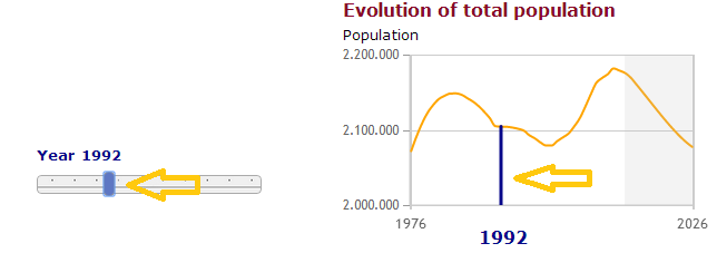
- Using the slider bar under the options for modifying the pyramid ("Other options of the pyramid"). Sliding the bar to the left or right the year of the visualization decreases or increases, respectively.
- Through the evolution graph of the total population. Clicking on the green bar is displayed when bring the cursor to the chart.
In both cases, when changing the year, the data for that year is loaded.
Technique
This tool uses jqPlot library for displaying graphics. It uses JavaScript for adding interactivity, therefore the JavaScript option must be enabled in your browser.
It is cross-platform, so it is possible to visualize in Android, iOS and the most popular browsers (Internet Explorer 8 +, Firefox, Google Chrome, Safari, Opera).
The tool is fully functional, although for proper operation in Internet Explorer 8 plugin "excanvas" is used, which makes loading and handling much slower than in other browsers. If the loading or operation seems too slow, it is recommended to use a different browser.
